TigerSafe Redesign
App Redesign/May 2021
My graduate university Rochester Institute of Technology has a department called public safety where people on campus can ask for assistance. And they have a coordinated app...
My First View


Call
Chat
Tool
Setting
Map
Walk Through it
1. two main access

dysfunctional hierarchy, confused structure, to many steps, too many blankets
2. two cultural access

classic American cultural functions, hard for international users, too many steps
3. one map system

too complicated, inconsistent, disorganized, interrupt the main attention
Conclusion
The cuurent app is lack of
Correct user profile
Action Response
Functional Heriachy
Emergency Access
Clearness and Aesthetics
Emotional Help to Users
I Redesigned it
I redesigned the whole UI system including the brand logo, a set of Icons, the color palette, and some responsive motions.
I also considerred and rearranged its UX system. Now it focuses on emergency communication and assistance for campus safety. I improved the original contacts way and got rid of most public-safety-unrelated elements.

Considerations


Wireframe

Color Consideration
All Hifi Pages
Interaction Prototype
The Actived Page
Enough response to make every action clear


Startup and Login
Smooth trasformation and perfect consistency to make the brand reliable to help seekers.


SOS Trigger
Heartbeat response and waiting animation to release help seekers' stress
Safety Contents and Call
Clear service lists, separate contact ways, and

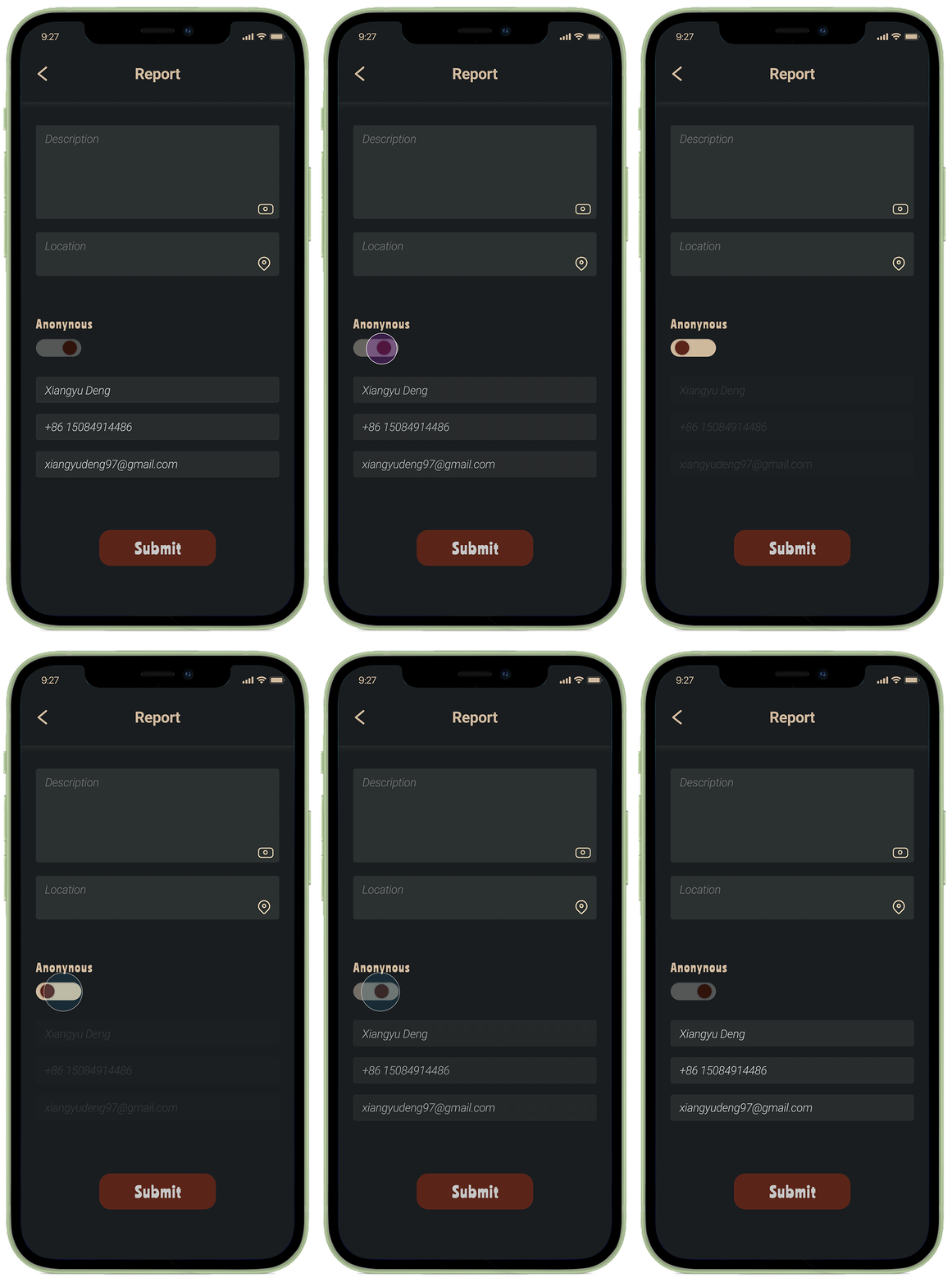
Anomynous Switch


Setting and Logout
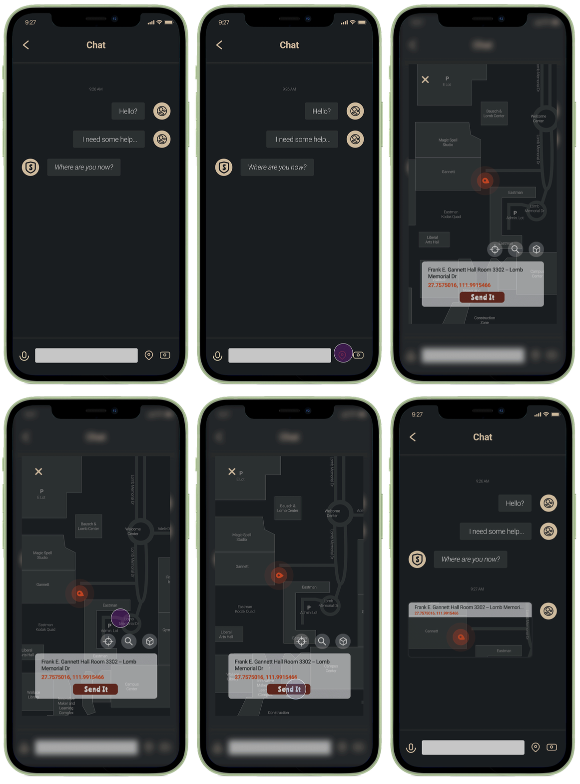
Send Location
App Introduction


